D. Figures and visualizations as engagement tools
A figure is an access component sitting inside the claim-bearing core
Section I.B catalogued the tables and figures characteristic of each structural variant, and II.F treated tables as instruments for fixing an experimental protocol. Neither considered what IV.C’s reading path makes unavoidable: figures are consumed early, out of order, and by readers who have read little else. In I.C’s vocabulary this produces an unusual situation. A figure sits physically inside the claim-bearing core, among the components carrying the article’s argument, but functionally it behaves like the Title and Abstract — it serves access and orientation, letting a reader self-select and orient without relying on context established elsewhere. I.C’s warning about the Title and Abstract therefore transfers directly: a figure that is intelligible only when read alongside the surrounding prose has failed at the function it is actually performing, however well it illustrates that prose.
Two exemplars beyond I.B’s three are useful in this section, because the running examples were chosen for their structures rather than their graphics. Kaplan et al., “Scaling Laws for Neural Language Models” (arXiv 2020), and Tenney, Das, and Pavlick, “BERT Rediscovers the Classical NLP Pipeline” (ACL 2019), are both articles whose central claims are carried visually, and each illustrates something the three standing examples do not.
The caption states the claim, not the object
The single highest-value revision available in most drafts is to captions, because captions are read by nearly everyone and drafted as afterthoughts. A caption naming its object — Figure 2: Accuracy by model scale — tells a reader what the axes already tell them and adds nothing. A caption stating what the figure shows — Figure 2: Accuracy on the diagnostic set remains near chance at every model scale tested, while accuracy on the standard benchmark rises steadily — is a claim, checkable against the figure, and it delivers the finding to a reader who will look at the figure and read no surrounding prose at all.
Kaplan et al.’s first figure is the practice done well, and it is worth quoting because it is unusually explicit. Its caption reads: “Language modeling performance improves smoothly as we increase the model size, dataset size, and amount of compute used for training. For optimal performance all three factors must be scaled up in tandem. Empirical performance has a power-law relationship with each individual factor when not bottlenecked by the other two.” Three sentences, three claims, and a reader who has read only that caption has the paper’s contribution, including the condition under which the relation holds — which is a hedge, in III.B’s sense, placed in a caption. The caption is doing the work of an abstract, for the substantial population of readers whose first contact with the article is the figure.
The pull figure
Most articles have one figure that appears on the first page and is read immediately after the abstract, and its job is to make the contribution graspable in a single look. What that requires differs by what the contribution is. For the Transformer paper (I.B), it is an architecture diagram, because the contribution is a structure and the structure can be drawn. For Kaplan et al., it is three panels of loss against parameters, dataset size, and compute, because the contribution is a relation and the relation is visible as a straight line. For a diagnostic study like HANS, the strongest first figure is usually neither: it is a small table of examples showing what the phenomenon looks like, because the contribution depends on the reader understanding what a case where a heuristic and the correct label diverge actually is, and no diagram conveys that as quickly as three sentence pairs do.
The common failure is to default to an architecture diagram regardless of what the contribution is. A system diagram in an article whose contribution is empirical spends the most valuable graphical position on the machinery rather than on the finding, and orients the reader toward what was built rather than what was learned.
Qualitative examples make an abstract finding concrete
Section I.B recorded tables of representative examples for all three variants, and their function is worth stating explicitly because it is an engagement function rather than an evidentiary one: an example converts an aggregate into something the reader can picture, and a reader who can picture a finding retains it. A four-point difference in accuracy is a fact; a pair of inputs where the baseline fails and the method succeeds is an image of that fact, and the two are remembered very differently.
The cost is that examples are selected, and selection is where this device shades into misrepresentation. The discipline is to state the selection criterion — randomly drawn from the disagreement set, or chosen to illustrate a named failure category identified in the analysis — so that the reader can calibrate what the example is evidence of. An uncharacterized example is not evidence of anything, and presenting one as though it were is a practice with an ethical as well as a rhetorical dimension, taken up further in Part V.
Choosing between a table and a figure is a functional choice
Tables and figures are not stylistic alternatives. A table serves exact-value lookup and comparison against numbers the reader may need to cite, quote, or reproduce; a figure serves relation, trend, and ordering. Putting a headline result in a figure alone is an engagement gain paid for with an evaluative loss, since a reader who wants to compare the reported number against their own system now has to estimate it off an axis. Putting a trend in a table alone is the opposite error: fifteen rows of numbers that would have been one visible curve, from which no reader will reconstruct the shape.
Tenney et al. is the case where the choice is decisive. The paper’s claim is that BERT represents the steps of the traditional pipeline “in an interpretable and localizable way, and that the regions responsible for each step appear in the expected sequence: POS tagging, parsing, NER, semantic roles, then coreference.” That claim is about an ordering across layers, and an ordering is what a figure shows and a table conceals — the same numbers arranged in rows would require the reader to perform the comparison themselves, and the article’s contribution is precisely that the comparison comes out in a particular order.
A figure asserts a strength, as a sentence does
Section III.B established that the modality of a sentence should match the strength of the evidence behind it. Figures make claims too, and the same rule applies with the same force, but the assertions are made through design choices rather than through verbs, which is why they escape the scrutiny prose receives. A truncated vertical axis asserts that a difference is large. A line drawn through four points asserts that the relation continues between and beyond them. A single bar per condition, with no interval, asserts that the value would recur on a rerun. Each of these can be true, and each is overclaiming when it is not.
Error bars, confidence intervals, and per-seed scatter are the visual equivalent of a hedge, and they behave exactly as III.B described hedges behaving: they make the strength of a claim legible at the moment it is made, rather than deferring it to a Limitations section the figure’s readers may never reach. Axis choice is a claim of the same kind. Kaplan et al.’s panels use logarithmic scales on both axes, and that is not a formatting preference but an assertion about the form of the relation — a power law appears as a straight line under those axes and under no others, so the choice of axes and the paper’s central claim are the same decision. A reader who understands this can check the claim by looking; a reader given linear axes could not have.
Legibility is a precondition, not a finishing touch
A figure that cannot be read has no engagement value whatever, and the failure modes are mundane and pervasive: text scaled down until it is illegible at print size, series distinguished only by hue in ways that collapse under grayscale printing or common colour-vision deficiencies, and architecture diagrams packed with labels no reader will resolve on paper. These are not aesthetic complaints. Given the reading path in IV.C, a figure is the article’s most-consulted evidence after the abstract, and an unreadable one converts the article’s highest-attention surface into a blank.
Matching to the structural variant
Section I.B’s three apparatus paragraphs already anticipate most of what this section adds. The system/method paper’s pull figure is its architecture or pipeline diagram, and its central evidentiary object is a baseline comparison table where exact values matter, which is why that comparison belongs in a table and the ablation trend often belongs in a figure. The empirical/analysis paper is the most figure-dependent of the three, since I.B listed trend plots, heatmaps, and per-category breakdowns as its characteristic apparatus, and its findings are typically relations rather than values — it is also, for the same reason, the variant most exposed to the axis and interval failures above. The resource/dataset paper has the most heterogeneous apparatus, mixing statistics tables that are pure lookup, an agreement table that is evidence of quality, and an annotation pipeline diagram whose function is closer to the Method’s reconstruction role than to engagement, which is worth recognizing so that the pipeline diagram is not asked to serve as a pull figure it is not shaped to be.
A worked example
Suppose the syntactic-diversity result used since III.B were to be presented graphically. The article has three quantities: the 4.1-point gain on the benchmark, the per-seed spread across three runs, and a breakdown of the gain by syntactic construction. The decisions follow from what each is for. The headline comparison against the domain-matched baseline goes in a table, because a reader will want to cite the number and compare it against their own; the per-seed values go into that same table as an interval rather than into prose, because their function is to establish that 4.1 is not within run-to-run noise, and a reader who cannot see the spread has been asked to take that on trust. The breakdown by construction goes in a figure, because it is an ordering — which constructions benefit most — and an ordering is what a figure shows and a table conceals.
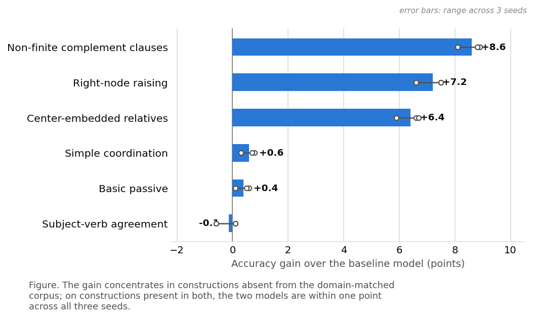
The caption for that figure is where the section’s rule bites. Before: “Figure 3: Accuracy gain by syntactic construction.” After: “Figure 3: The gain concentrates in constructions absent from the domain-matched corpus; on constructions present in both, the two models are within one point across all three seeds.” The first caption labels the axes a second time. The second states the finding, states the condition under which the finding does not hold, and reports the seed spread — three claims delivered to a reader who has looked at one figure and read nothing else, and each of them checkable against the figure they are looking at.
Common failure modes
The caption that labels rather than claims is the most widespread and the cheapest to repair. Beyond it: the figure that duplicates a table, presenting the same eight numbers twice and doubling the space the results occupy without adding a relation; the architecture diagram legible only at the size it was drawn on screen; the truncated axis, which is the visual form of the intensifier III.F catalogued, asserting a magnitude rather than showing one; and the figure that no sentence in the article ever refers to, which signals that it was produced during analysis rather than for the argument, and which a reader will read for a claim the article never makes. A subtler failure is the results figure in place of a results table where the reader’s need is comparison — an article whose main numbers cannot be read off a page is an article that will be cited approximately or not at all.
A practical check
Cover the body text and read only the title, the figures, and their captions. The contribution, the principal evidence for it, and the conditions under which it holds should all be recoverable. This is the graphical counterpart of IV.C’s skim-layer check, and the two together describe the article as a large fraction of its readers will actually encounter it. Where the check fails, the repair is almost never a new figure; it is a caption that states what the existing figure shows.